Thursday, January 22, 2009

C is for Machine stitched Color Hue shibori


Inspired by the work and words of some other Surfacing members, I decided to try some machine stitched shibori with Color Hue dyes. Color Hue is an instant strike colorant that requires no setting, so it seemed to be a good choice to play with as I tried machine stitching.

My first experiment was on a 10x17" scrap of habotai. I used my serger, knife up, and made simple lines of ruffled stitching using the differential feed set at 2. As I progressed down the fabric I tried catching multiple layers of previously ruffled areas. Finally, I rolled the fabric into a tube and tied it with some monofiliment line that was handy. I wet the fabric and applied some undiluted ColorHue. The result was disappointing, and the serged stitches were a pain to disassemble.

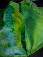
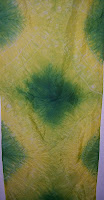
The second experiment was on the sewing machine. As suggested by Thelma, I loosened the tension and made straight stitches. I used a scarf and sewed multiple wide darts down the length of a 14x60" habotai scarf. The darts were then defined by 2 more lines of stitching. Pulling the bobbin threads was easy. I dip dyed the scarf in yellow and blue. Multiple dips were made on the blue areas. Then I removed the stitches. After photographing the predominantly yellow scarf I decided to overdye the piece in blue to colorize the white areas. The final scarf is predominately green and the stitched resist areas are a very pale blue. I mourned the loss of contrast, but believe the final scarf is still worthy of gifting.
If I repeat this process I will use the same dart stitch design, and use less dilute Color Hue for all parts of the dyeing process so the final product has more contrast. That way the stitched lines would be more obvious.

Monday, January 19, 2009

B is for Bones, a self portrait


This is my second submission in the Surfacing group's 2009 alphabet project. It is my first attempt at a non-fashion project and is called a self portrait because it shows the current state of my arthritic hand bones.

The fabric is habotai that was first dyed with a super thick alginate paste colored with Crimson green label liquid dye. I salted the surface just to see if any salt effect would happen in the midst of the thick alginate. To my surprise the color separated and the surface became a mottled red/orange/yellow. I thought it properly represented inflamation.

The bones were drawn on freezer paper. Mind you, the shape of each bone was deliberate as I tried to capture the radiographic image of the deformities in each bone. I arranged the bones with a little artistic license on the habotai and hit them with the iron.

Next, I covered the hands in used dryer sheets hoping to get a little texture in the next dye. My print paste was on the thin side so I think I lost some of the texture that might have been interesting and made the finished product less realistic. The black dye was screened on and a heat lamp was used to speed the drying. The underlying fabric had been dyed and steam set a few weeks ago. I used a chemical set on the black because I was in a hurry.

The pieces were washed with synthrapol once. I decided to leave some residue of the alginate so I could keep some extra body in that part of the piece and add some sheen. Once ironed the pieces felt a bit like light paper because of the alginate residue.

There is something ugly and scary about these images, but I enjoyed making them. I may permanently mount them on the black habotai backdrop, or they may just reside in my studio. Either way, it was cathartic to do this project. Remember your hands, take care of them, treat them gently as you age.

Sunday, January 11, 2009

Girl friends, grits, gifts and the aging goddess

This is to those of you who have jumped, limped, or been carried over the age 50 hurdle . Have you grieved the loss of your goddess self image? You know, that prideful inner creature that admired her image in the mirror from the first bloom of beauty. She may have had many imperfections, but she was your best. You could dress her up and turn a few heads. She surely relied on her looks a little too much at times.

My dear friend stopped by the other day. The old goddess had a headache and could not face the day so I fed us some scrambled eggs with cheese and grits for lunch and gifted her a dress that I had just made for myself. We laughed about the grits - they are so chic now - once a simple mainstay of my southern breakfasts, now called by a variety of names on menus on 4 star menus from Philadelphia to San Francisco. My friend was raised on Matzo and is a compulsive dieter. She feared the grits as I spooned them on her plate. It was her old goddess self image trying to deny her. Yet, she ate them and felt better.

That is what happens when the aging goddess lets go and allows herself to not fear the extra pound on her bottom. It's not about the grits, my dear. It is all about feeling good now and being liberated from the compulsions that little goddesses hold to keep themselves thin. Perfection for the aging goddess is just feeling good. Isn't that grand? If I had known, I would have grown older sooner.

Saturday, January 3, 2009

Almond Colorway3

Posted by Picasa

Almond print2

Posted by Picasa

Almond print 1

Posted by Picasa

Surfacing Alphabet Project-Letter A

"Surfacing", a Yahoo internet group that graciously accepted me as a member, has kicked off 2009 with a year long project relating to the alphabet. Each letter of the alphabet serves as the inspiration for a surface design project.

I chose almond stamping as my "A" project. Why? I had spent an afternoon with my husband looking at his native american indian relic collection. It is always awe inspiring to look at tools and artistic pieces from prehistoric times. The primitive people used what ever was at hand to express themselves. I looked around my house for something related to A that was natural and unusual that I could incorporate into a design. The first thing I found was an almond. I cut up a couple and set to work using this unusual tool.

The nuts were shelled and roasted. However, the meat of the nut still had a considerable amount of oil. I dried the nut halves with a paper towel but there was plenty of oil still in the nut meat that served an unexpected purpose as the project progressed.

A heavy LV alginate was mixed and allowed to refrigerate overnight.

The fabric pieces I used were 8" x 10" silk broakcloth remnants from a previous project. They had been dyed a light silver grey. The additional tools and materials involved were a 2" piece of cellulose sponge, a yard of serger tail, a 4" brayer, a 1" foam brush, sewing tweezers (to hold the nut!), crimson red and black green label Jacquard acid dyes.

My intention was to create 2 pieces of the same colorway that both incorporated the almond as a design element. Three pieces were produced that were interesting to me without further embellishment. Note that the almond oil acted as a partial resist in the stamping. It allowed the base color to peek through and appear irridescent.

Would I use an almond as a stamp again? Probably. I think it has a place in my work when I need a small design element for highlight. It would be also be possible, but tedious, to use it to create a quasi-animal print. I like its varied and organic footprint.

Now I am thinking "B"!
 
Dyers Web Ring
Powered By Ringsurf